Image - 2026-05-25 09:16
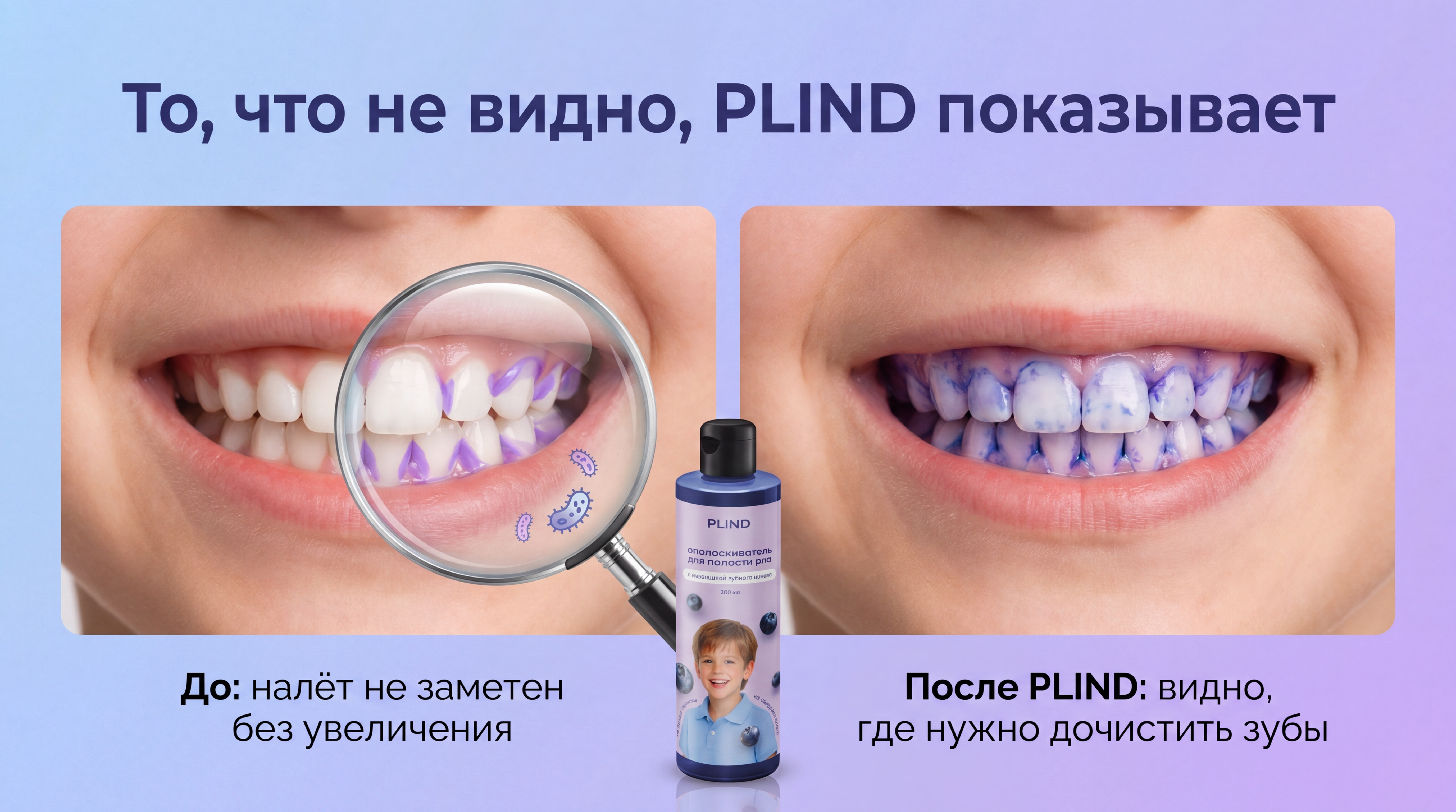
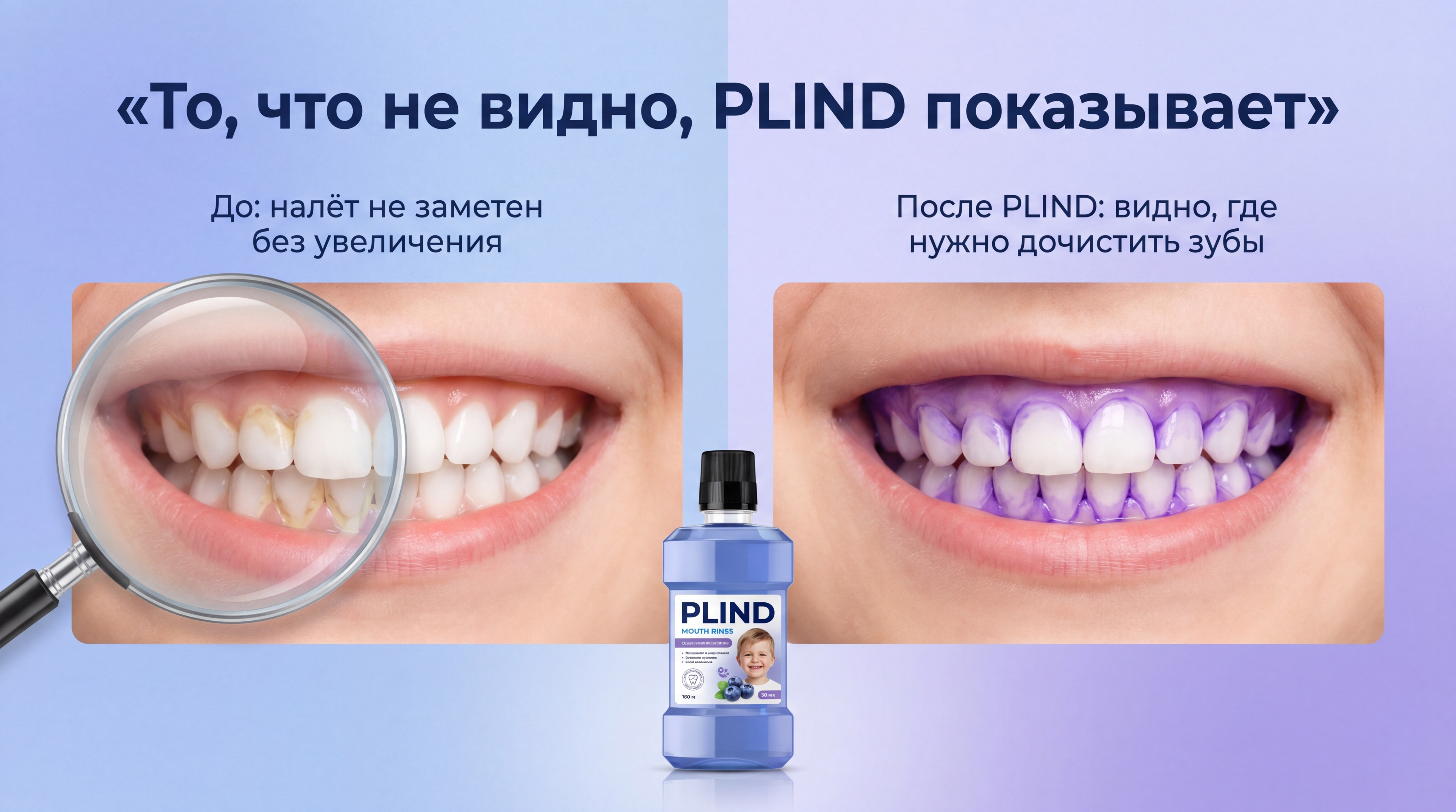
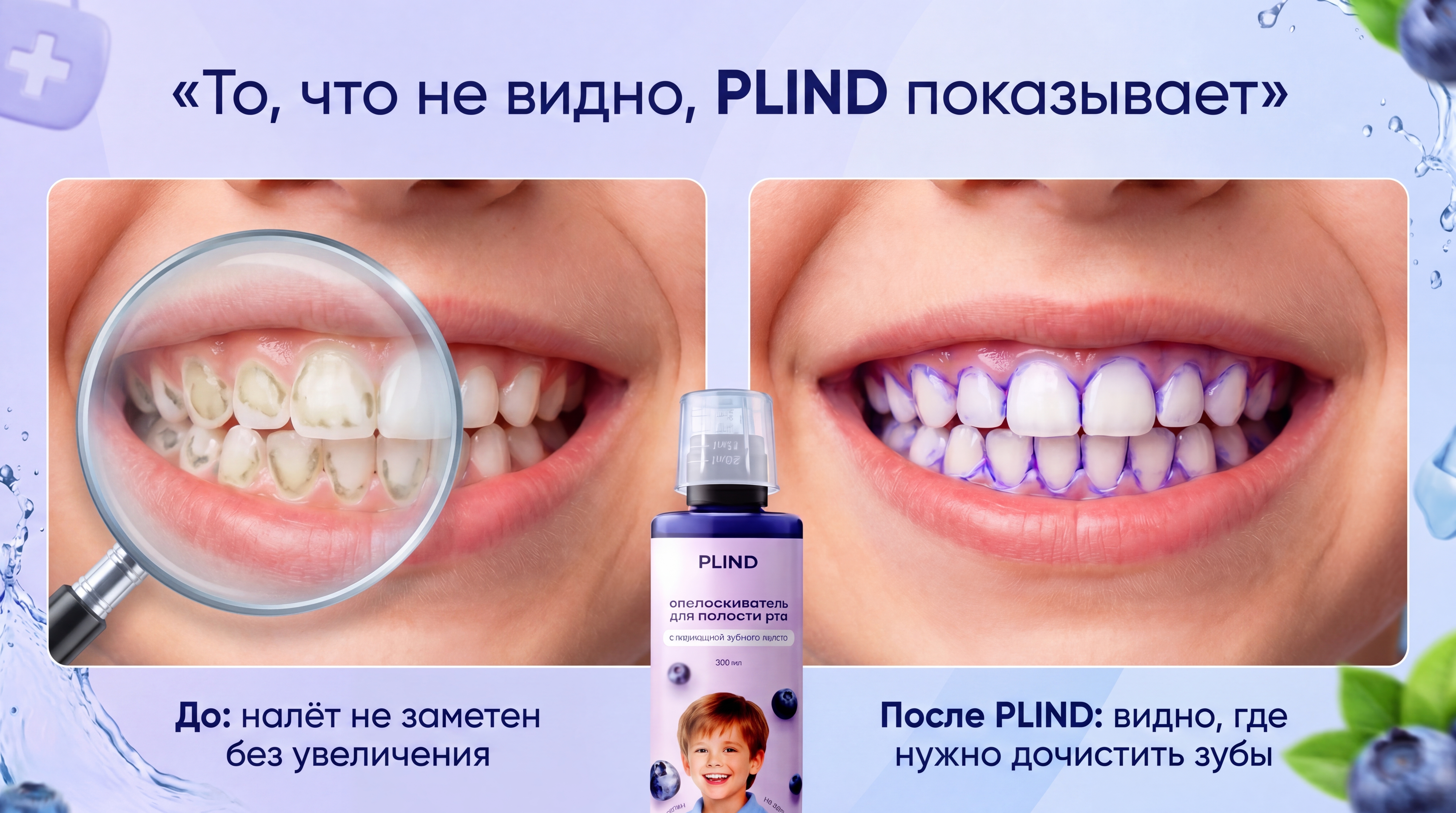
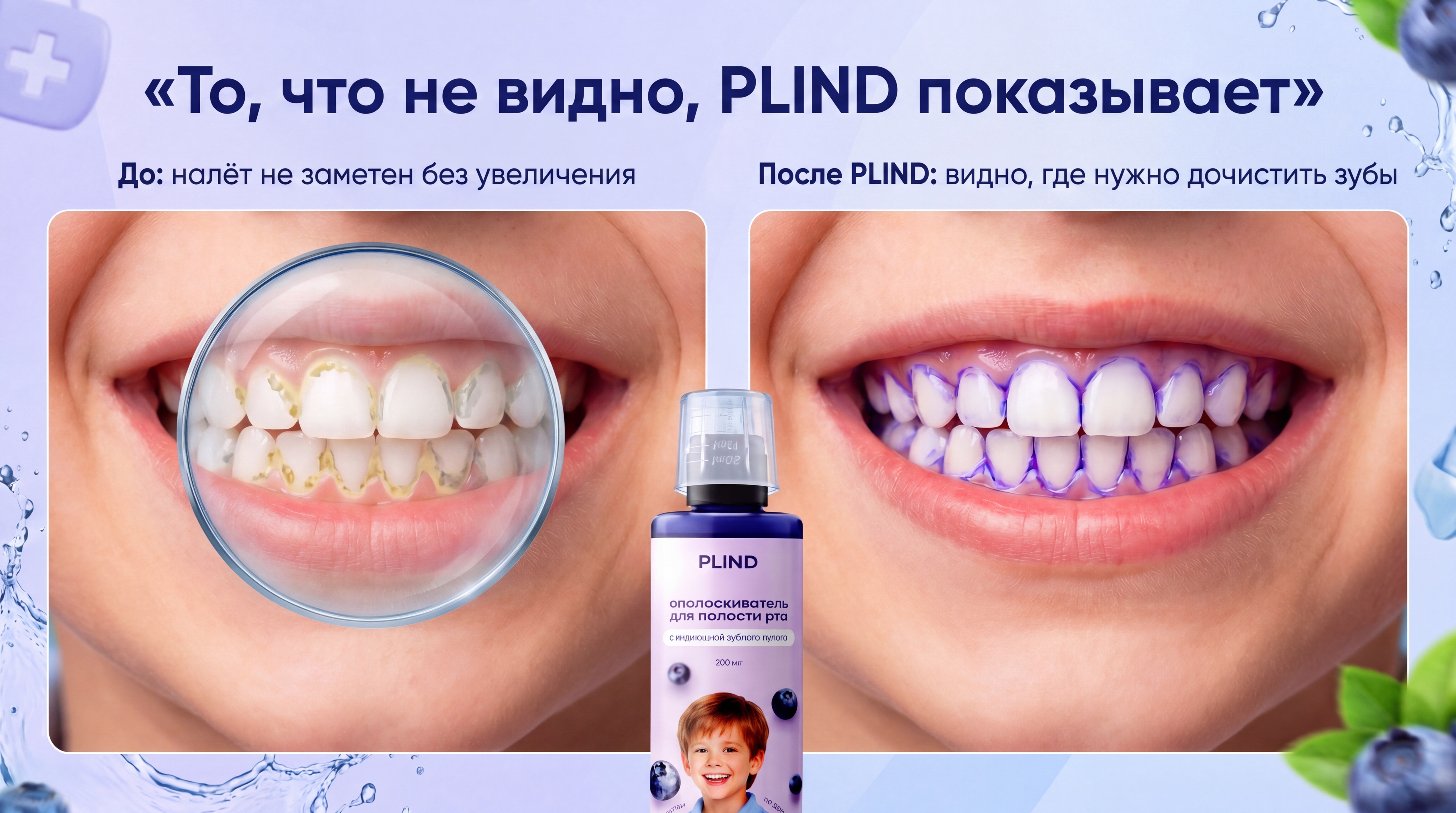
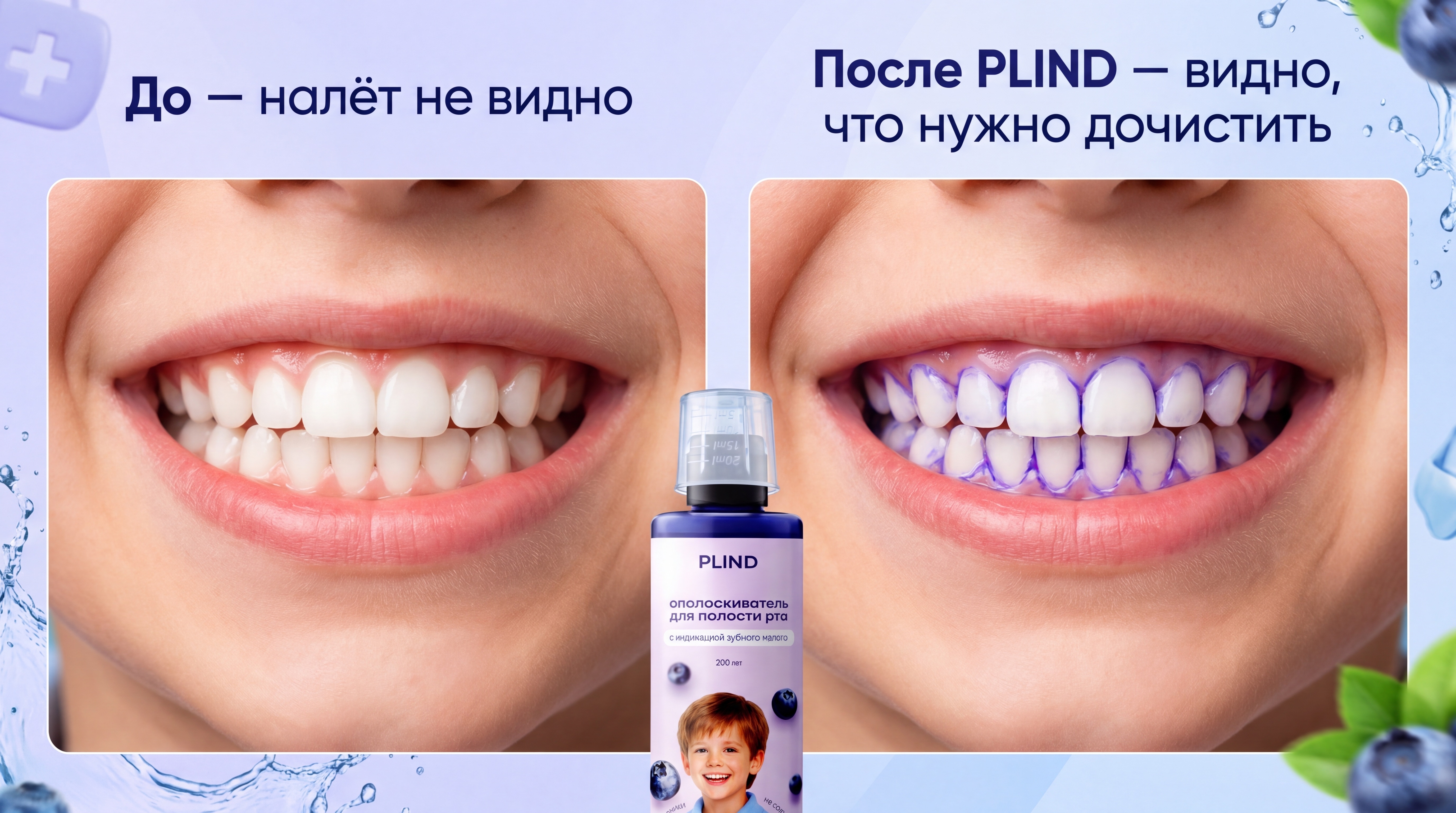
Use my attached PLIND materials and previous rich content as reference. Keep exactly the same visual style and color palette as my existing PLIND infographics and first slide: soft blue, violet and lavender tones, clean premium family look, modern typography, smooth gradients, no clutter. Create a photorealistic “before / after” slide for a Russian marketplace rich content section. The slide must visually explain how PLIND reveals hidden plaque, with minimal text. Overall layout: horizontal image (3:4 or 16:9) split into two equal parts “before” and “after”, with the PLIND bottle connecting them in the center bottom. Top headline, centered across the whole slide, in Russian: «То, что не видно, PLIND показывает» Typography for the headline must match the first slide style: modern clean sans‑serif, dark blue or deep violet text, high contrast, premium look. LEFT SIDE — “BEFORE” (До): Show a close‑up of a child’s smile and teeth, filling the left half of the slide. At first glance, the teeth should look clean and white. Inside this left half, place a realistic magnifying glass overlay over part of the teeth: a circular lens with soft edge, light reflection and slight glass distortion. Inside the magnifying glass, show clearly readable plaque on the tooth surfaces: uneven translucent films, stripes and patches in soft violet tones, especially along the gum line and between teeth, in the areas that are usually not brushed well. The plaque must look like real build‑up, not just a thin outline. If you show bacteria characters, place them directly on top of the plaque on the teeth, very small and secondary, never floating in the air, and no more than two or three tiny icons. Outside the magnifying glass, the teeth remain almost perfectly white and clean, so only the zoom reveals the hidden plaque. Under the left image, add a very short caption in Russian: «До: налёт не заметен без увеличения» RIGHT SIDE — “AFTER” (После) — keep similar to the last good version: Show the same teeth and same angle on the right half of the slide, as if it is the same child after using PLIND. No magnifying glass here. The indicator has colored the plaque areas in a natural way: not only along the edges of the teeth, but as irregular patches and translucent films on the tooth surfaces, in gentle violet tones that clearly look like mouth rinse dye. Focus the dye exactly on the same typical problem zones that were visible under the magnifying glass on the left (near the gums, in interdental spaces, on rough surfaces). Clean enamel where there is no plaque should stay mostly white. Avoid drawing only sharp comic outlines; the dye must sit on plaque, not on the entire tooth. Under the right image, add a short caption in Russian: «После PLIND: видно, где нужно дочистить зубы» CENTER BOTTOM — PLIND bottle: At the bottom center, between the “before” and “after” images, place the real PLIND mouth rinse bottle from my photos. The bottle must be 100 percent accurate to the real product: same shape, cap, label design, colors, proportions, branding and printed text. Do not redesign, relabel, simplify, distort or replace the bottle. Show it slightly in front, with realistic reflections and light, visually connecting both halves and clearly indicating that PLIND caused the visible effect. Style and details: – Match the lighting, gradients and general mood of the first slide: soft cool light, premium and calm family bathroom feel. – Keep the background minimal so the main focus stays on the teeth, plaque and dye, not on extra decorations. – Keep all text minimal: top headline plus two single‑line captions under “before” and “after”. – The main idea must be clear without reading much text: before, hidden plaque is видно only inside the magnifying glass; after PLIND, the same areas are clearly colored, showing children and parents exactly where to brush again.

Бесплатный старт · Генерация видео и картинок с ИИ за секунды
More from this creator
More L images
См. все →