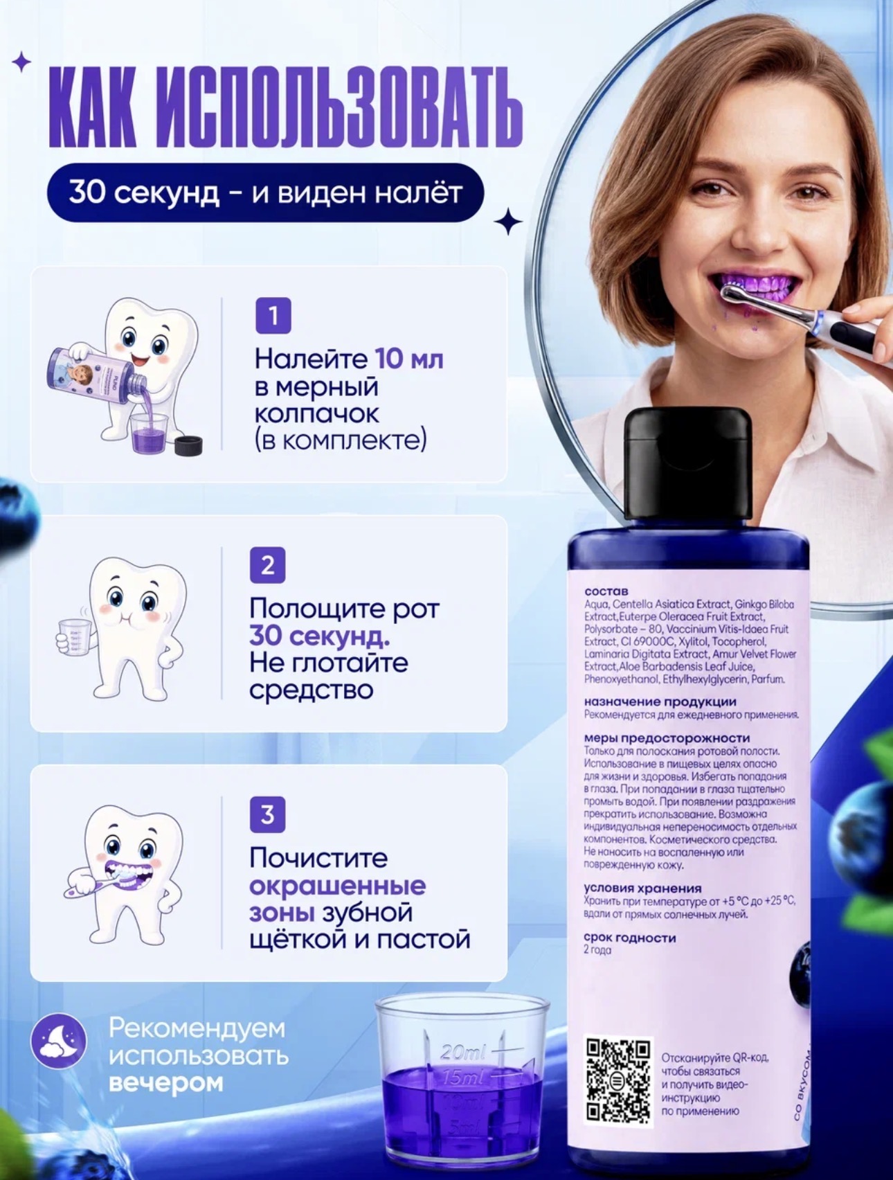
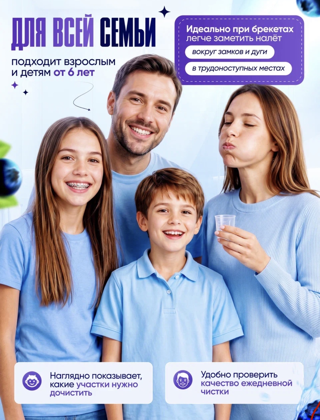
Image - 2026-05-24 08:35
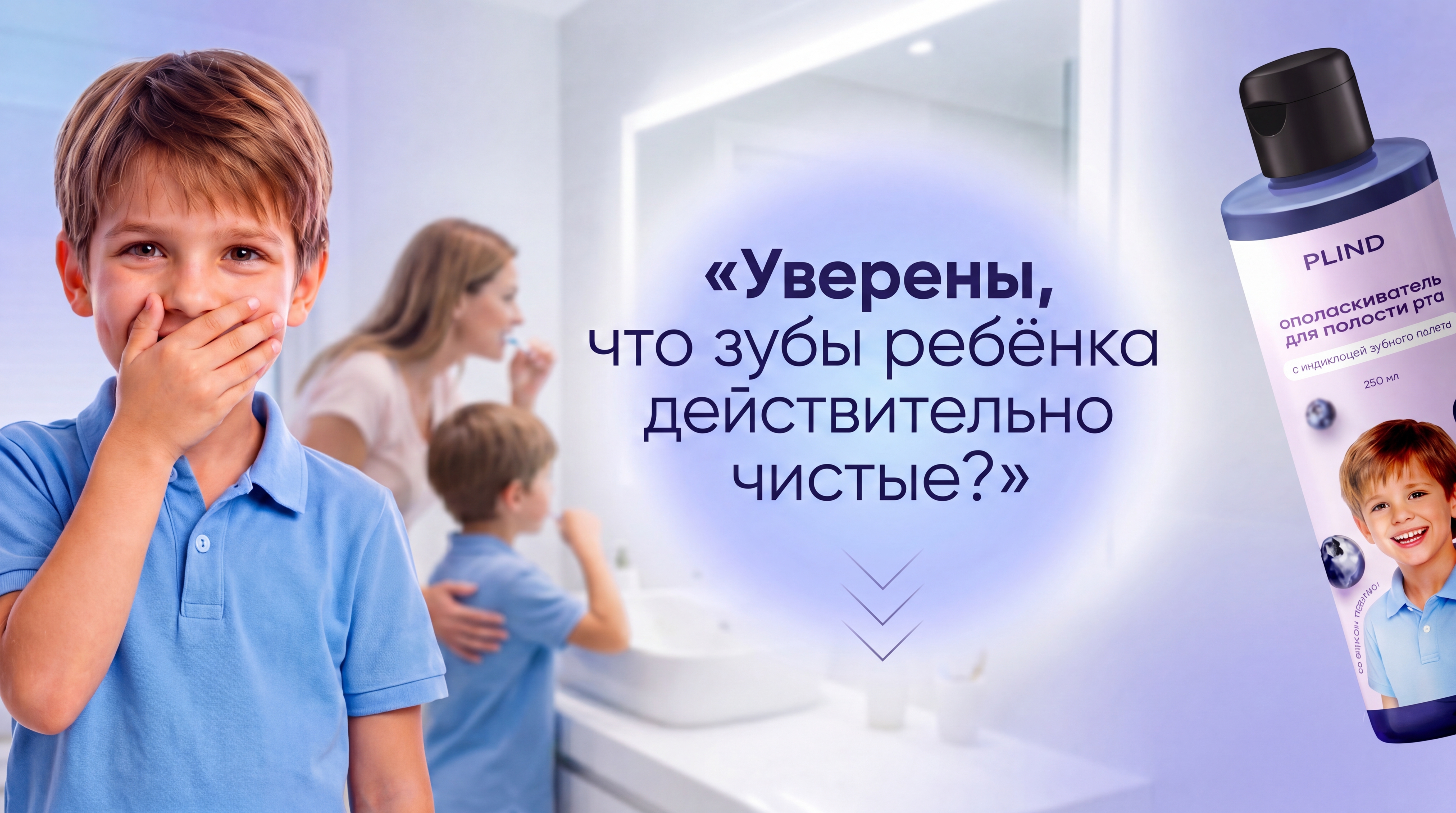
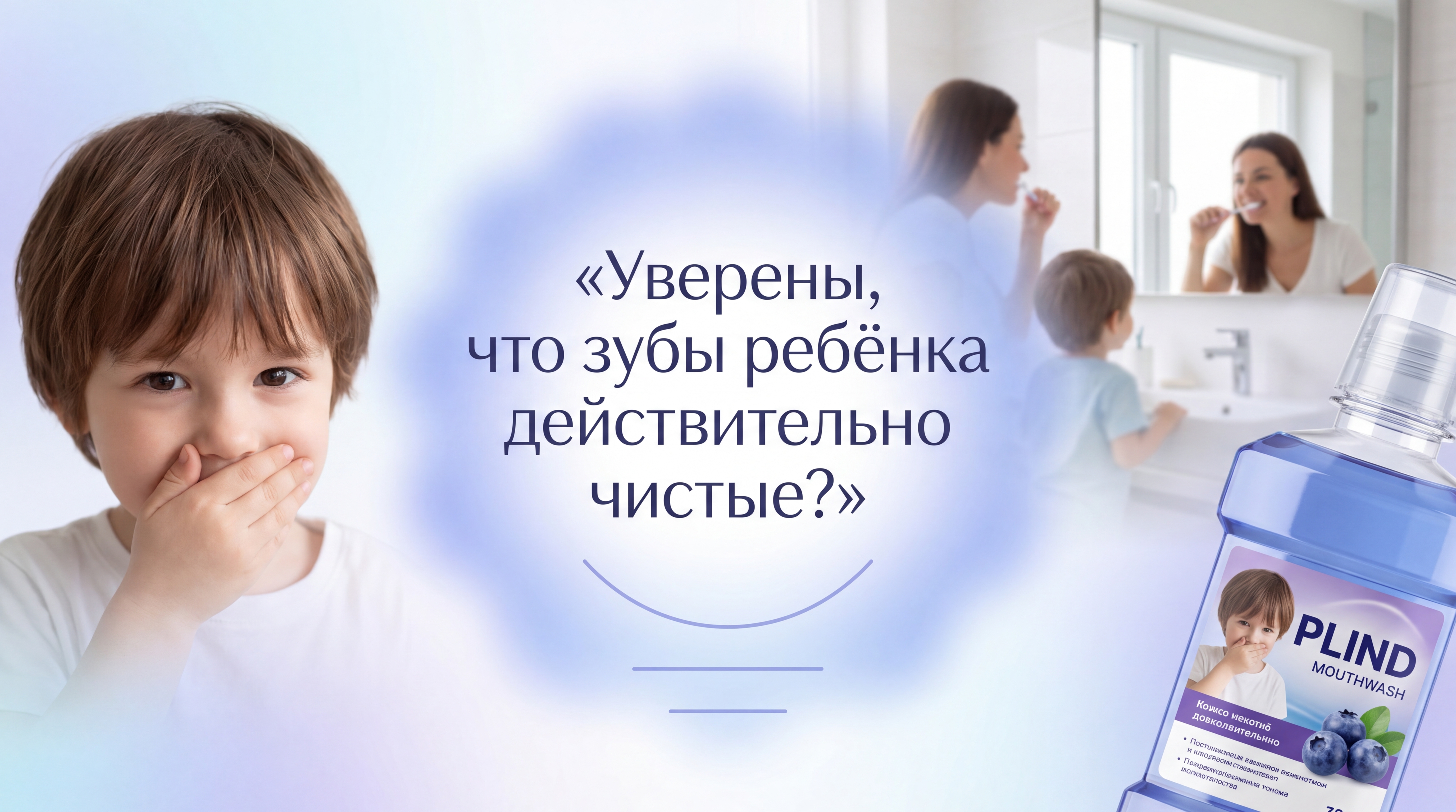
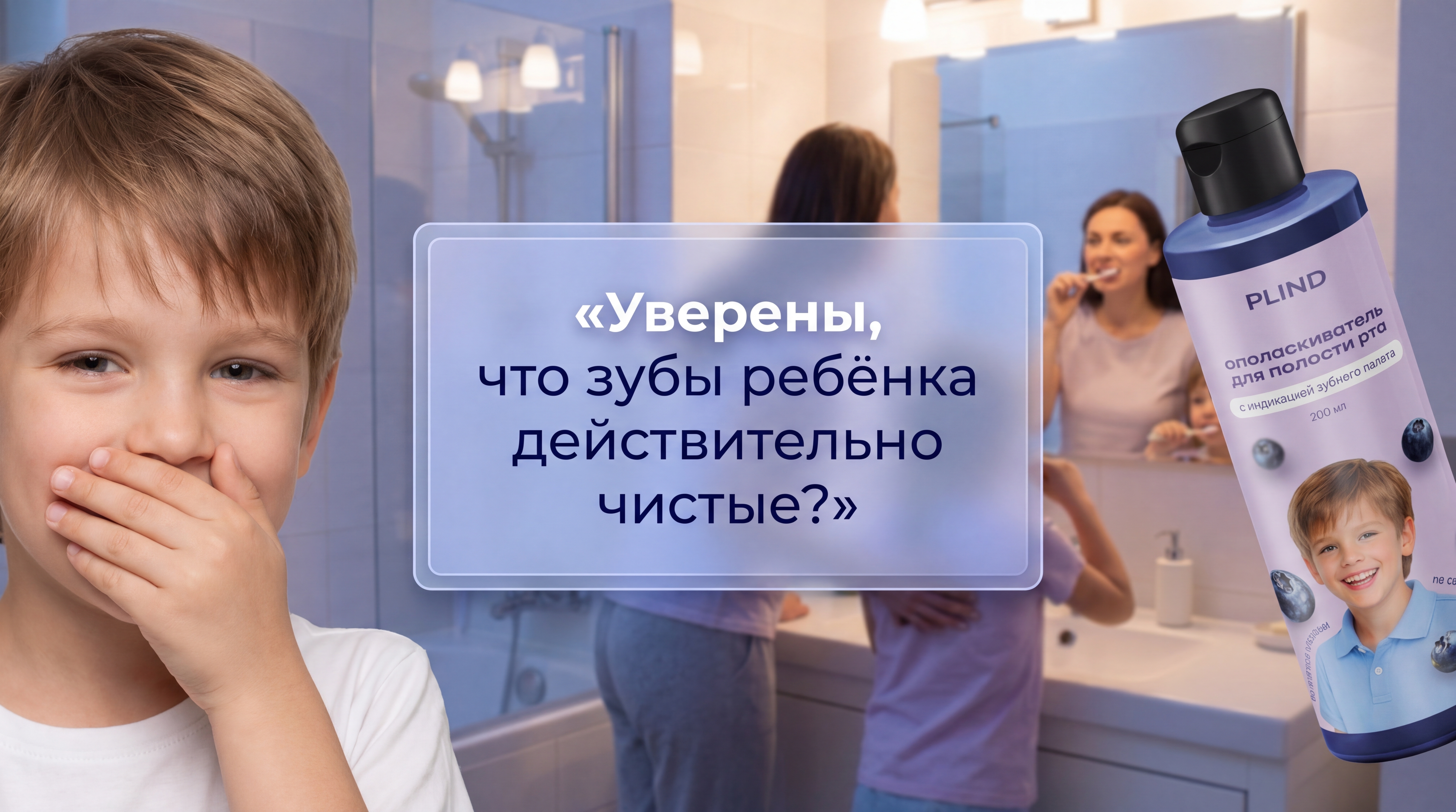
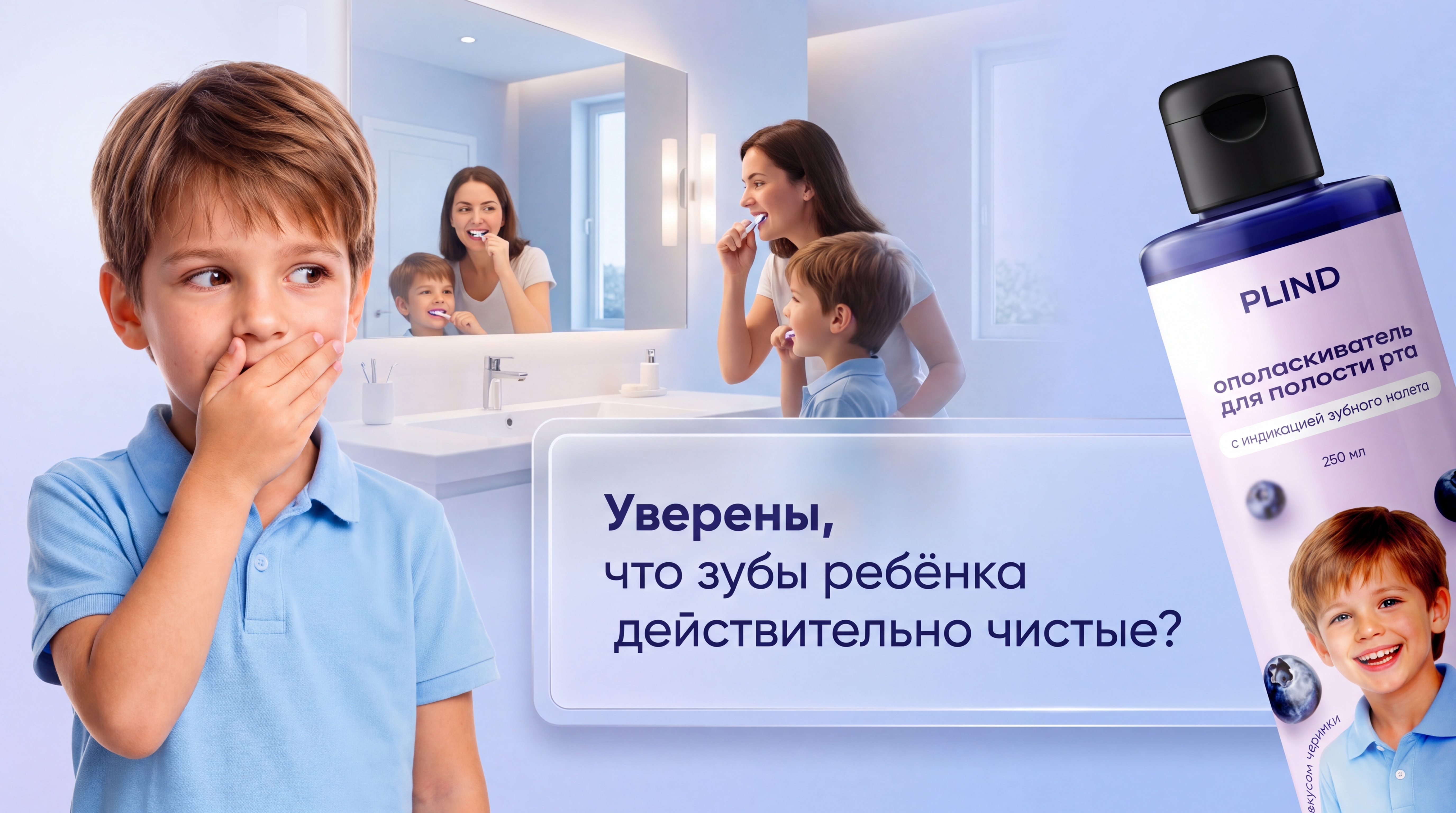
Use my attached source images as reference. Use the real PLIND bottle exactly as in my photos: same bottle shape, cap, label, colors, proportions, branding and printed text. The product must stay 100 percent accurate, realistic and sharp. Do not redesign, relabel, simplify, distort or replace the bottle. Create a photorealistic premium teaser first slide for a Russian marketplace rich content section. This image will be heavily center‑cropped in the marketplace preview, so the main message must fit only inside the central safe area. Composition: – Left side: a child shown large from chest up, occupying the left 28 percent of the frame. The child covers their mouth with one hand in a shy, playful way, as if not fully sure their teeth are really clean. The child’s head (eyes and forehead area) must be positioned on approximately the same horizontal level as the central headline, so that the face remains visible inside the central crop. – Background center: a softly blurred mother and child near the sink and mirror in a bright modern bathroom, checking their teeth. – Right side: the real PLIND bottle entering from the right 30 percent of the frame at a natural three‑quarter angle, partially cropped, only about 60–70 percent of the bottle visible, visually attractive but clearly secondary to the headline. IMPORTANT SAFE AREA FOR MARKETPLACE PREVIEW: Put all important text only inside the central 42 percent of the image width and the central 25 percent of the image height. No important letters or symbols outside this zone. The headline and the subtle “open” hint must remain fully readable when only the middle narrow part of the image is visible in preview. Main text block: Place the headline exactly in the visual center of the image, inside this safe area. Do not use a classic glass rectangle, UI card, button or framed panel. Instead, create a modern premium highlight behind the text: a soft diffused luminous cloud / smooth oval glow / blurred light island in blue‑lavender tones, elegant and airy, without hard borders. It should feel like luxury beauty advertising, not like an app interface. Headline text in Russian, centered, large, elegant and highly readable: «Уверены, что зубы ребёнка действительно чистые?» Use modern premium sans‑serif typography with balanced spacing and strong contrast; the first word can be slightly bolder. Directly under the headline, still inside the same central safe area, do not use obvious arrows or chevrons. Instead, add a very subtle neutral downward accent: for example, a short soft curved underline that opens slightly downward, or three tiny horizontal lines with decreasing width, stacked vertically like a minimal “gravity” mark. This accent must be delicate, abstract and elegant, only hinting that there is more content below, without looking like a classic arrow or button icon. Layout coordinates: the child occupies the left 28 percent of the frame and the child’s head is aligned horizontally with the center text block; the text occupies the central 42 percent of the frame; the bottle occupies the right 30 percent of the frame. All important text must stay inside the center 42 percent width and center 25 percent height of the image; treat this as a strict crop‑safe zone for the marketplace preview. Color palette: match my existing PLIND infographic style — soft blue, violet, lavender, white, light cool gradients, clean premium family aesthetic. No extra text, no badges, no additional logos, no clutter. One strong central question, shy child gesture on the side at the same vertical level, cropped PLIND bottle on the opposite side.
Бесплатный старт · Генерация видео и картинок с ИИ за секунды
More from this creator
More L images
См. все →